Custom Website Header Design: Backpacking Matt
I recently got the opportunity to work with Matthew Kyhnn, better know by most as Backpacking Matt and the owner of a blog by the same name.
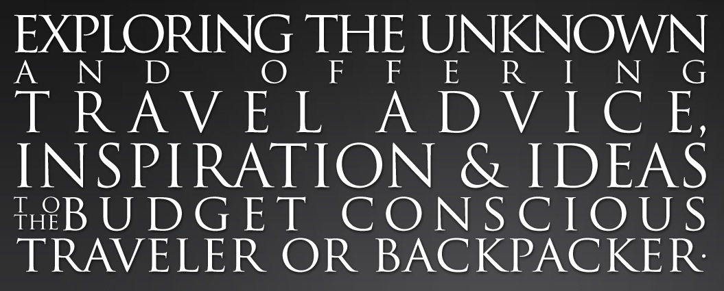
Matt contacted me about doing a new header for his website and, being a fellow traveler, I was excited to work with him. Matt wanted a header with the emphasis on his tagline – “Life’s a Journey” and also to include his blogs mission statement:
The other design element Matt wanted was a world map to indicate travel to the viewer before they even read anything.
I initially sent Matt three different concepts which we worked from to come up with the final design. Here are concepts one two and three.
Custom Website Header Design: Backpacking Matt Concept 1
Custom Website Header Design: Backpacking Matt Concept 2
Custom Website Header Design: Backpacking Matt Concept 3
Matt liked concept three the most, so we moved foreword with revisions on that one. After a few more revisions, we finalized the design and this is the end result. We were both really happy with how it turned out and it now sits proudly at the top of Matt’s blog for all to see.
Custom Website Header Design: Backpacking Matt Final
One of the elements I enjoyed working on the most for Matt was his tagline text. This was one of the first times I have hand crafted typography into a particular space. Click below to see a closeup of the final result.
Here are some of the comments people posted about the new header:
– Lauren
– Angela
– Dyanne
To see more comments, check out Matt’s post announcing the new header here.
I enjoyed working with Matt and highly recommend his blog as it is full of useful information for traveling the world with specialization in backpacking in New Zealand.
If you would like to read about and see anther custom website header design I did, check it out here.


2 Comments
The design is definitely an improvement, and it’s great to see your design process steps. Based on your 3 concepts it looks like you prefer a cleaner aesthetic of a separation between text and “world” logo in the background – but on the final version the text overlaps the world logo, and makes it a big more ambiguous as to what it is. Was that intentional?
December 19, 2011
Glad you like the design Jay and thanks for the question.
As you noticed, I was trying to keep the words from overlapping in the initial and revised concepts, but in the end, we decided that making the text bigger and more readable was most important and we also both liked the depth that overlapping the text on the map gave the header.
You can still see that it is a map of the world, so we felt nothing was lost there, but wanted the text to be the most prominent and easy to read objects on the header.
Hope that makes sense. Let me know if you have any other questions and I’ll be glad to respond.
January 23, 2012