Visual Presentation of Information
I saw this video first on TED and really enjoyed it. If you haven’t check out TED Talk I highly recommend them. TED stands for Technology Education Design and TED Talks are videos of people from all over the world sharing innovative ideas, perspective changing information and more.
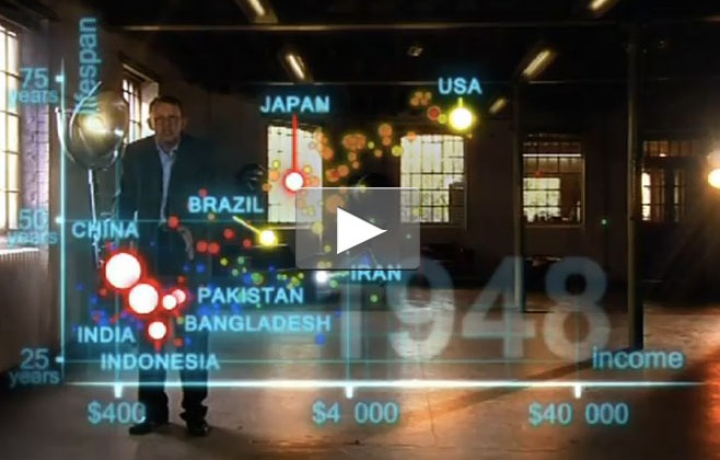
I saw this new version of it the other day and thought I would share it. I love how Hans Rosling takes what could be boring and hard to interpret data of more than 120,000 numbers and maps it out visually to create an entertaining, easy to understand and very educational display of information. The video graphs out the average life expectancy and income per person for 200 countries over 200+ years. I think this video is a great example of how complex data, when visualized correctly, can allow the viewer focus on it’s relevancy and potential application/relevance instead of getting lost in the numbers. Hope you enjoy!
Do you have similar examples of great data visualization? Share them in the comments.


