Website Customization & Implementation for Wild Orchid Airlines
When David Fleming decided to start his Chartered Airline Company in Darwin, Australia, he came to me wanting a clean, minimalist website that would present a strong brand image to his potential clients.
David is no stranger to HTML himself and he actually provided me with a mock up website of his idea. I took this concept and made a customized WordPress template focussing on strong unified branding and custom graphics to give this start up airline a look of professionalism and trust. I also worked with David to make the site as simple and easy to navigate as possible and used a premium WordPress plugin to allow booking and checkout on the page with secure payment via credit card and/or paypal.
Featured aspects of this project
The home page of the website is designed to be as intuitive and minimal giving the user two possible choices – book now or get more info.
The booking page is built around the Gravity Forms WordPress Plugin allowing for flight class, route and date selection as well secure and painless checkout by credit card or PayPal.
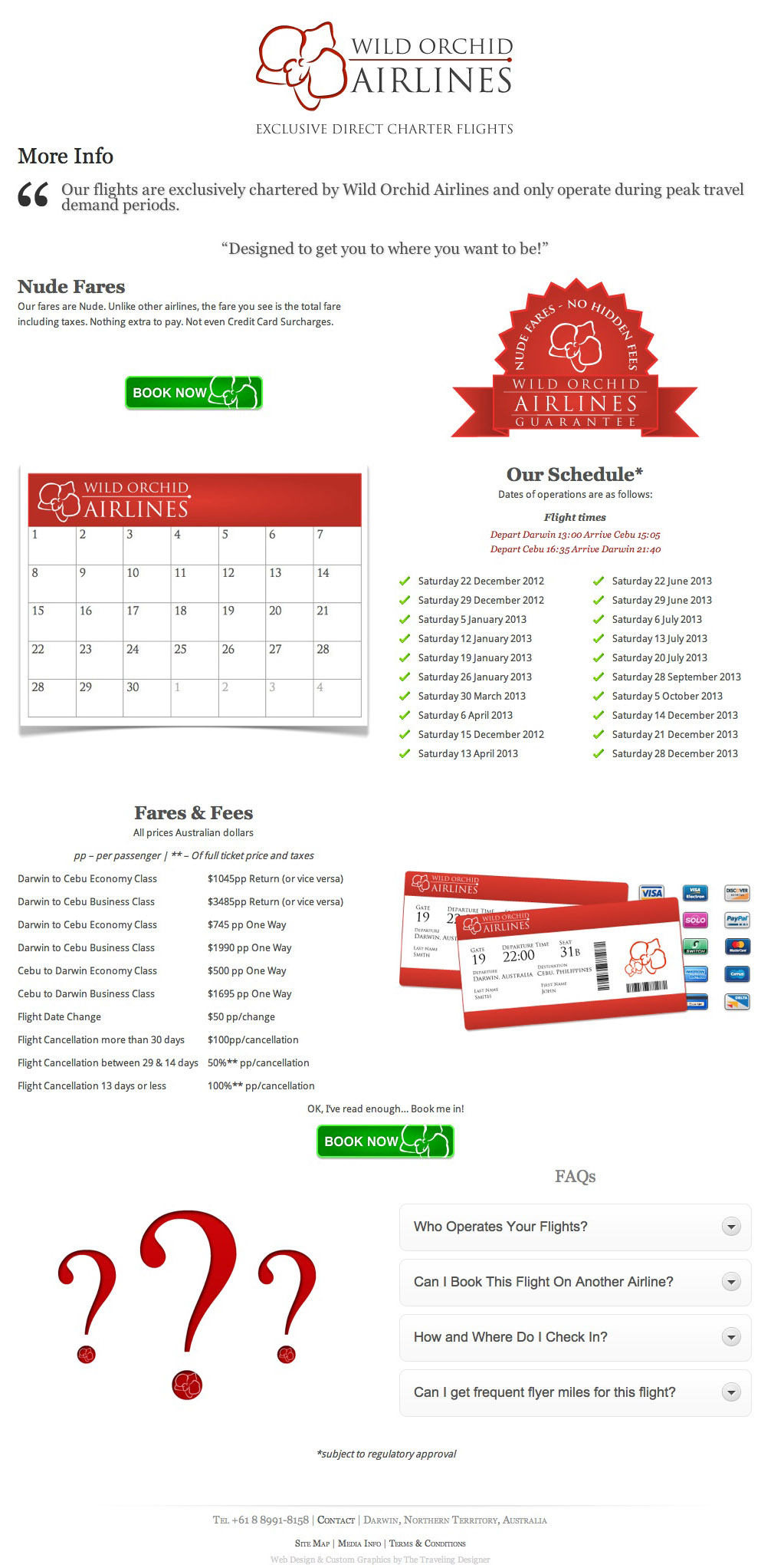
The more info page is where I really got to have some fun making some custom graphics and spending time making the text easy and interesting to read. You can see what it looks like below and click the image to visit the live site.
Here is a selection of some of the hand crafted graphics that I made for the page. Click to view large.
Since this was a brand new airline, we both wanted the website to have strong branding throughout giving the viewer added trust and confidence that they were here to stay and not just something that was thrown together. The website has only three main pages with some additional pages in the footer which allowed me to spend most of my time on the design, custom graphics, layout and user experience in order to ensure a pleasing and easy research and checkout process.
Once the website was finished up it was time to get ready for the marketing and promotion which you can read more about here.

